Stress Test Widget
This widget forecasts the behavior of the portfolio under extreme macro events. Because correlations and volatilities tend to increase during market extremes, it is critical to anticipate portfolio behavior before these events occur.
Widget Components
The widget has two linked charts side by side:
| Chart | Description |
|---|---|
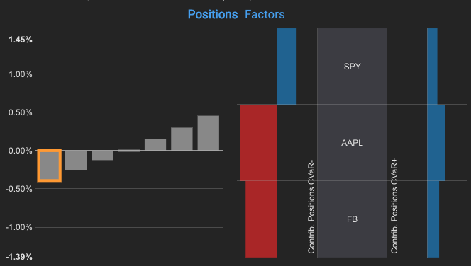
| Left — Portfolio response | Grey bars showing portfolio-level P&L for different shocks of an exogenous index. The shock range is calculated automatically by Everysk. In some templates, a specific bar is pre-selected to highlight the most relevant shock; click it to toggle the highlight |
| Right — Position contributions | Red/blue bars showing how individual positions (or aggregations such as sectors) contribute to portfolio tail properties for the active shock. Red bars indicate negative contributions, blue bars indicate positive contributions. Sorted by Expected P&L |
When the portfolio has more than 10 securities, only the top 5 and bottom 5 contributors are shown.
Reading the Charts
Clicking a grey bar on the left locks the shock selection and enables detailed inspection on the right chart. Moving the mouse over the right chart reveals the three P&L properties per position:
| Property | Description |
|---|---|
| CVaR− | Average P&L of the worst 5% outcomes (left tail) |
| Expected | Average P&L across all outcomes |
| CVaR+ | Average P&L of the best 5% outcomes (right tail) |
The sum of any property across all positions equals the portfolio-level value for that property.
Tooltip
Moving the mouse sideways over the left chart updates the right chart in real time. Click a grey bar to lock the selection; click it again to unlock.
Interpreting Asymmetry
For a symmetric shock on any factor, compare the leftmost and rightmost grey bars. They are generally similar in size, but portfolios with options may show significantly different magnitudes — this indicates asymmetric responses to symmetric shocks and is an important signal when evaluating optionality and convexity in the portfolio.